In this lesson, we will use a new Page Layout tool called CSS Grid to quickly and easily create any page layout you can dream of:
Best of all, this tool can be used to create a series of “Responsive” grids that display well on any device used by viewers to access your business website.
Why do we need CSS Grid?
Previously, we learned that we can create colorful boxes on web pages by using the divide tag. One problem with these boxes in the past was that they might not display well on different widths of screens. A web page might look good on a laptop but look bad on a mobile phone or a tablet. What was needed was a way to automatically adjust the width of a series of boxes of content to fit the width of whatever screen it was being displayed on. Recently a new method was developed called CSS Grid to make it much easier for us as web page designers to lay out boxes of content that respond to the width of any given viewing screen.
Our plan will be to first set up a one column layout for narrow screen devices like mobile phones. We will then create a second layout for wider screen devices like tablets and laptops. We will then set up a third layout for very wide screens used with desktop computers.
Our primary goal is to make sure that the main content area of the web page is readable. This means that the lines of text in the main content area should be at least 500 pixels wide but no wider that 800 pixels – as really wide screens have too many words in a line making the text very hard to read. As one example, an 8 ½ inch wide sheet of paper with one inch margins has a column width of 6 ½ inches. As one inch is about 100 pixels, then 6 ½ inches is about 650 pixels. This is a page width most people are used to reading.
We will accomplish this goal by using a single column layout up to 750 pixels in width. We will then change to a two column layout with a 500 pixel main content area and a 250 pixel side bar. Both boxes will expand at this 2 to 1 ratio until the screen width is 1200 pixels – making the main content 800 pixels and the side bar 400 pixels. We will then change to a three column layout where the main content is 600 pixels and both side bars are 300 pixels. This will expand to a maximum width of 1600 pixels where the main content will again be 800 pixels and both side bars will be 400 pixels.
Below are the steps to achieve these three layouts:
Step 1: Create Divides without CSS
Before we see how CSS Grid can help us, let’s look at how divides work without CSS Grid. Open Bluefish and enter the following into a new test.html document:
<!DOCTYPE html>
<html><head><meta charset="utf-8" />
<title>Test 1</title></head>
<body>
<div class="grid-container">
<header>Header</header>
<section>Feature 1</section>
<section>Feature 2</section>
<section>Feature 3</section>
<aside>Aside 1</aside>
<main>This is the Main Content box for this web page. </main>
<div class=”extra”>Extra Content Area.</div>
<footer>Footer</footer>
</div></body></html>
Save the file as test.html. Then view the file in your web browser:
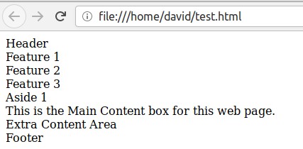
This page looks drab because we have not applied any styling to the page (not even Paragraph or Heading tags).
Step 2: Add background colors and a CSS Grid container
Next, save the file as test1.html. Then add the following internal style sheet to the head of the file:
<style type="text/css">body {background: #ddddff;}
.grid-container {background: #9999ff; max-width: 750px; height: 95vh;
margin: 0 auto; padding: 10px; text-align: center;
display: grid; grid-gap: 20px;}
header {background: #ffaaaa;}
section { background: #ddaaff;}
aside { background: #aaddff;}
main { background: #99ff66;}
.extra {background: #aaffff;}
footer { background: #ffff33;}</style>
Then save the file and view the page with your web browser:
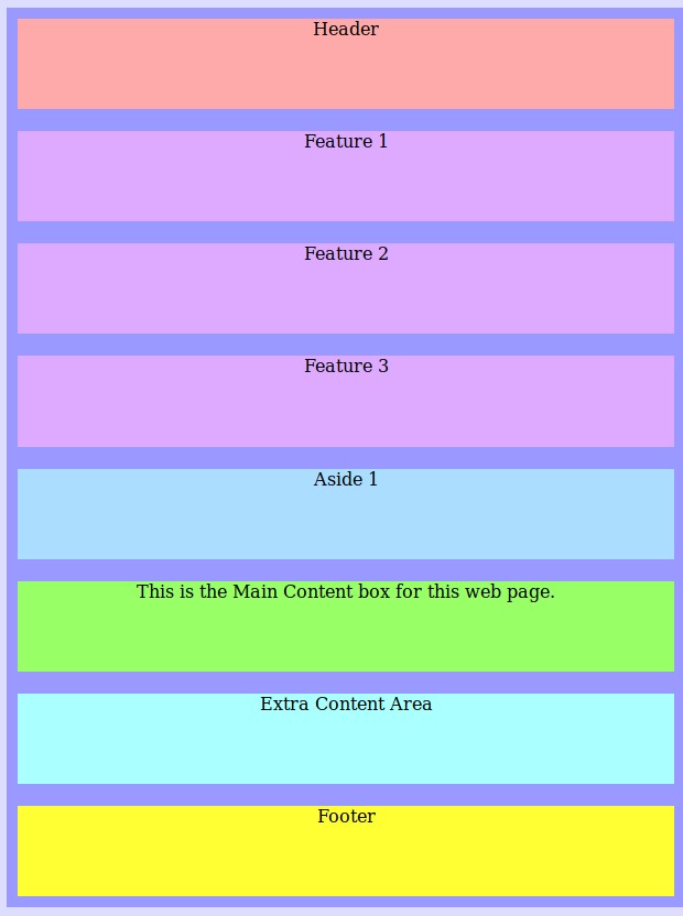
A single column layout is the default layout for CSS Grid. All we have done is give the Grid Container a maximum width and height and given some space between the child boxes and given each box a color.
Step 3: Add a media query that will apply to all screens over 750 pixels wide. Then define our grid columns and grid rows.
Next, save the file as test2.html. Then add the following internal style sheet to the head of the file just below the existing styles:
@media screen and (min-width: 750px) {
body {background: #ddddff;}
.grid-container {background: #9999ff; max-width: 1200px; height: 95vh;
margin: 0 auto; padding: 10px; text-align: center;
display: grid; grid-gap: 20px;
grid-template-columns: repeat(12, 1fr);
grid-template-rows: 2fr 3fr 5fr 40px;}
header {background: #ffaaaa;
grid-row: 1; grid-column: span 12;}
section { background: #ddaaff;
grid-row: 2; grid-column: span 4;}
aside { background: #aaddff;
grid-row: 3; grid-column: span 3;}
main { background: #99ff66;
grid-row: 3; grid-column: span 9;}
.extra { background: #aaffff;
grid-row: 4; grid-column: span 12;}
footer { background: #ffff33;
grid-row: 5; grid-column: span 12;}}
</style>
Then save the file and view the page with your web browser:
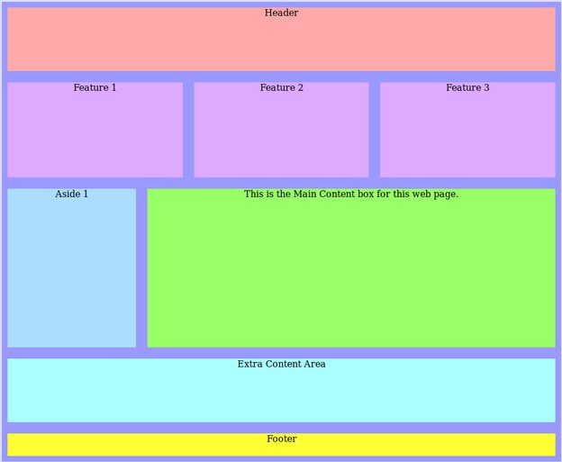
Grab the right edge of your browser and slide it to the left to make the screen narrower. Notice that the boxes take up the full screen no matter what the width is and none of the boxes are hidden. When you narrow the screen below 750 pixels, it turns into the one column mobile phone display.
You can also grab the bottom of the window and make it shorter. All the boxes still remain displayed taking up the full height of the window.
Let’s take a closer look to see what each of the lines we inserted did:
body {background: #ddddff;}
The above CSS simply made the background for the body (which is the background for the whole web page) very light blue.
.grid-container {background: #9999ff; max-width: 900px; height: 95vh;
margin: 0 auto; padding: 10px; text-align: center;
display: grid; grid-gap: 20px;
grid-template-columns: repeat(12, 1fr);
grid-template-rows: 2fr 3fr 5fr 40px; }
The above CSS created a Grid Container which holds all of the other boxes of content on the page. CSS Grid always requires a Grid Container. You can see the Grid Container because we have made it a darker color of blue than the body.
We have set the maximum width of the container to be 1200 pixels so that it will be easier to read the words on the web page.
We have also set the height of the web page to be 95vh. Vh stands for Viewport height which is the height of the browser window. 95 stands for 95%. This means that the Grid Container will take up 95% of the browser window height.
The margin of the Grid Container is 0 auto meaning that the container will be in the middle of the screen rather than on the right side of the browser window.
The padding is set for 10 pixels to make sure that the content is not too close to any edges of the screen or boxes. Text align center makes the text appear in the middle of the boxes.
The most important part of the above CSS is
display: grid; grid-gap: 20px;
grid-template-columns: repeat(12, 1fr);
grid-template-rows: 2fr 3fr 5fr 40px;}
Display grid is what tells the browser that we want all of the boxes inside of this parent container to display according to the rules set by CSS Grid.
Grid template columns are set to divide the width of the page into 12 equal parts. Individual boxes can then span any number of these hidden 12 columns as we want. The fr stands for Fraction – meaning that the width is divided into 12 equal fractions.
Grid template rows divides the height of the screen into five rows. The bottom row is set to be 40 pixels high. The remaining rows divide the total remaining height of the screen into 12 equal fractions. The first row gets 2/12 of the height, the second row gets 3/12 of the height and the third row gets 5/12 of the remaining height (after subtracting 40 pixels for the bottom row) and the fourth row gets 2/12ths.
header {background: #ffaaaa;
grid-row: 1; grid-column: span 12;}
The above CSS sets the header element to have a color of light red and to appear on row 1 and span all 12 columns.
section { background: #ddaaff;
grid-row: 2; grid-column: span 4;}
The above CSS sets the section elements to have a color of light purple and to appear on row 2 and to span only 4 of 12 columns. Since there are three feature sections, together they will take up all 12 columns. But if we had only two feature sections, we would change the span to 6.
What would you change the span to if you had 4 feature sections?
Step 3: Add a media query that will apply to all screens over 1200 pixels wide. Then redefine our grid columns and grid rows.
@media screen and (min-width: 1200px) {
body {background: #ddddff;}
.grid-container {background: #9999ff; max-width: 1600px; height: 95vh;
margin: 0 auto; padding: 10px; text-align: center;
display: grid; grid-gap: 20px;
grid-template-columns: repeat(12, 1fr);
grid-template-rows: 2fr 3fr 5fr 2fr 40px;}
header {background: #ffaaaa; grid-row: 1; grid-column: span 12;}
section { background: #ddaaff; grid-row: 2; grid-column: span 4;}
aside { background: #aaddff; grid-row: 3; grid-column: span 3;}
main { background: #99ff66; grid-row: 3; grid-column: span 6;}
.extra { background: #aaffff; grid-row: 3; grid-column: span 3;}
footer { background: #ffff33; grid-row: 5; grid-column: span 12;}}
Note that the only change we made in the above CSS was:
1. increase the maximum width from 1200 to 1600 pixels,
2 delete the fourth row that had the extra content.
3. change the main content area from span 9 to span 6
4. change the extra class from row 4 and span 12 to row 3 and span 3.
5. change the bottom footer row from row 5 to row 4.
Here is the result:
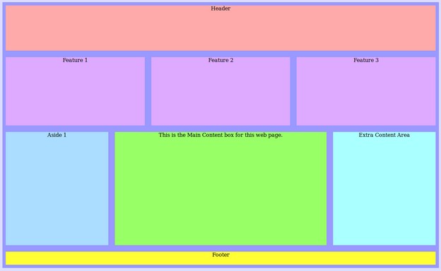
Change the width of the window to see the layout for Row 3 change to two columns and then one column.
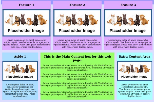
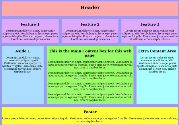
Step 5: Add Place Holder Text to your Web Page
We will next change the HTML to add some content and images to see what this will look like on a real web page.
<body><div class="grid-container">
<header><h1>Header</h1></header>
<section><h2>Feature 1</h2>
<p>Lorem ipsum dolor sit amet, consectetur adipiscing elit. Vestibulum eu lacus eget purus egestas fringilla. Fusce urna justo, elementum ut velit nec, ornare dapibus lacus. </p></section>
<section><h2>Feature 2</h2><p>Lorem ipsum dolor sit amet, consectetur adipiscing elit. Vestibulum eu lacus eget purus egestas fringilla. Fusce urna justo, elementum ut velit nec, ornare dapibus lacus. </p></section>
<section><h2>Feature 3</h2><p>Lorem ipsum dolor sit amet, consectetur adipiscing elit. Vestibulum eu lacus eget purus egestas fringilla. Fusce urna justo, elementum ut velit nec, ornare dapibus lacus. </p></section>
<aside><h2>Aside 1</h2><p>Lorem ipsum dolor sit amet, consectetur adipiscing elit. Vestibulum eu lacus eget purus egestas fringilla. Fusce urna justo, elementum ut velit nec, ornare dapibus lacus. </p></aside>
<main><h2>This is the Main Content box for this web page.</h2>
<p>Lorem ipsum dolor sit amet, consectetur adipiscing elit. Vestibulum eu lacus eget purus egestas fringilla. Fusce urna justo, elementum ut velit nec, ornare dapibus lacus. </p>
<p>Lorem ipsum dolor sit amet, consectetur adipiscing elit. Vestibulum eu lacus eget purus egestas fringilla. Fusce urna justo, elementum ut velit nec, ornare dapibus lacus. </p>
<p>Lorem ipsum dolor sit amet, consectetur adipiscing elit. Vestibulum eu lacus eget purus egestas fringilla. Fusce urna justo, elementum ut velit nec, ornare dapibus lacus. </p>
<p>Lorem ipsum dolor sit amet, consectetur adipiscing elit. Vestibulum eu lacus eget purus egestas fringilla. Fusce urna justo, elementum ut velit nec, ornare dapibus lacus. </p> </main>
<div class="extra"><h2>Extra Content Area</h2><p>Lorem ipsum dolor sit amet, consectetur adipiscing elit. Vestibulum eu lacus eget purus egestas fringilla. Fusce urna justo, elementum ut velit nec, ornare dapibus lacus. </p></div>
<footer><h2>Footer</h2><p>Lorem ipsum dolor sit amet, consectetur adipiscing elit. Vestibulum eu lacus eget purus egestas fringilla. Fusce urna justo, elementum ut velit nec, ornare dapibus lacus. </p></footer>
</div></body>
Step 6: Add Place Holder Images to your Web Page
We will next add links to some space holder images to see how images display in our Responsive CSS Grid Layout.
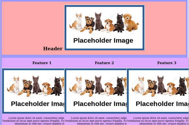
Unfortunately, Bluefish inserted images with fixed widths.
<img src="/images/placeholder.jpg" width="540" height="306" alt="">
We will change the width to 100% and delete the height:
<img src="/images/placeholder.jpg" width="100%" alt="">

What’s Next?
In the next section, we will use CSS Grid to add a horizontal menu needed for a multi-page website.