In this lesson, we will use a new Page Layout tool called CSS Grid to quickly and easily create any page layout you can dream of:

Best of all, this tool can be used to create a series of “Responsive” grids that display well on any device used by viewers to access your business website.
Why do we need CSS Grid?
Previously, we learned that we can create colorful boxes on web pages by using the divide tag. One problem with these boxes in the past was that they might not display well on different widths of screens. A web page might look good on a laptop but look bad on a mobile phone or a tablet. What was needed was a way to automatically adjust the width of a series of boxes of content to fit the width of whatever screen it was being displayed on. Recently a new method was developed called CSS Grid to make it much easier for us as web page designers to lay out boxes of content that respond to the width of any given viewing screen.
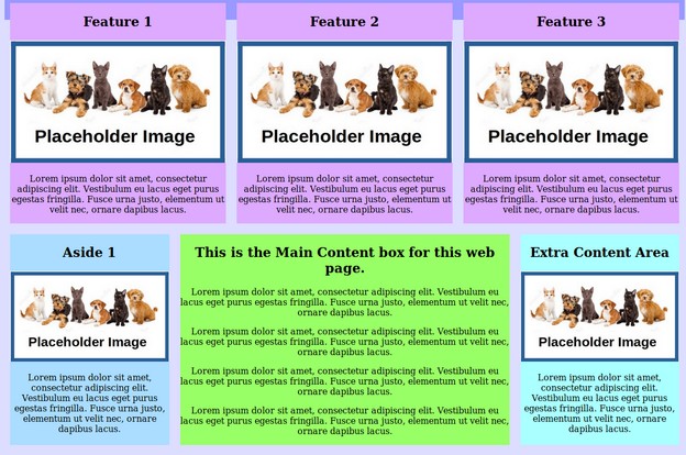
Our plan will be to first set up a one column layout for narrow screen devices like mobile phones. We will then create a second layout for wider screen devices like tablets and laptops. We will then set up a third layout for very wide screens used with desktop computers.
Our primary goal is to make sure that the main content area of the web page is readable. This means that the lines of text in the main content area should be at least 500 pixels wide but no wider that 800 pixels – as really wide screens have too many words in a line making the text very hard to read. As one example, an 8 ½ inch wide sheet of paper with one inch margins has a column width of 6 ½ inches. As one inch is about 100 pixels, then 6 ½ inches is about 650 pixels. This is a page width most people are used to reading.
We will accomplish this goal by using a single column layout up to 750 pixels in width. We will then change to a two column layout with a 500 pixel main content area and a 250 pixel side bar. Both boxes will expand at this 2 to 1 ratio until the screen width is 1200 pixels – making the main content 800 pixels and the side bar 400 pixels. We will then change to a three column layout where the main content is 600 pixels and both side bars are 300 pixels. This will expand to a maximum width of 1600 pixels where the main content will again be 800 pixels and both side bars will be 400 pixels.
Below are the steps to achieve these three layouts:
